Monday, March 30, 2015

Removing Heavy Texture

When I removed the dark green country print wallpaper back in 98, I textured the walls before painting them. 


It was a mix of paint, mud and sand that was dabbed on with a rag. 
 I gave it little peaks.
I would have preferred to pay to have orange peel blown in but we just couldn't afford it. Old World was just coming into vogue and the textured walls were perfect for that look.
I always knew that someday heavy texture would be out and I would have to deal with these walls.  
Fortunately I didn't go overboard with big peaks or swirls. 

I started on a Saturday morning with a scraper and a hammer. 


Bill quickly fired me. 
There are times when I simply do not have the muscle power to get a job done.
It took several hours but we were able to get most of the peaks of texture knocked down. When I say "we" I mean for the most part "he". 
Bill said this was a lot of work. He tried the sander but it didn't do anything. 
The scrapper and hammer was the most effective. 


Now you might be thinking that we ruined a perfectly good paint job. 
We did. 


If you remember, I painted my kitchen in December right before Christmas. I loved it- during the day. 


At night I didn't like it. 
After the sun went down on the very first night I feared that I'd made a mistake. 
Surely I was seeing things. 
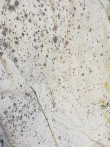
The cabinets and the wall color became a sickly very light yellow.
"No - our cabinets are white."
They didn't look white anymore. 
They didn't even look cream.  


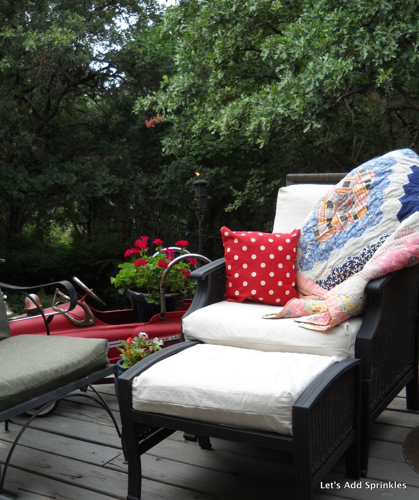
I have this same white wall color all through the entry and stair well and I love it. I even love it at night.


I thought that maybe I was tired and seeing things.
No.
I hated it at night and when it was cloudy. 
I tried to convince myself that it would be okay.
That I loved it during the day and that would be enough.


Do you know how much time a person spends in the kitchen at night?
As soon as we were done with dinner and cleaned up, I turned off the lights in the kitchen. 
I tried to ignore it.
I thought about getting new light fixtures that had whiter shades. 
Our light fixtures are only a few years old and I don't want to change them. 
I entertained the thought of repainting the cabinets. 
(Only for a minute.)
I knew deep down that re-painting the kitchen was the only answer. The  slightly off white cabinets would read whiter with a contrasting color on the walls.
It was the best way to go.
The easiest and least expensive.
But who wants to paint again after just painting? 
This room is hard to paint. There is a ton of hand painting around doors, windows, cabinets and shelves.  
I remembered a kitchen done by Nicole Curtis on the show Rehab Addict. I love that show.
It had to be the color of our next kitchen. 
She custom mixed the paint herself and I followed in her footsteps.  
I mixed Halcyon Green by Sherwin Williams with Glidden white. 
It was too blue so I added some green chalk paint. 
It still wasn't blue/green enough. A few drops of yellow acrylic artist's paint fixed it. This was very risky and for a minute I thought I'd ruined two gallons of white paint.
Bill kept saying it looked blue and it does but with a hint of green. 
It reminds me of the the color of an antique Ball jar.


 Vintage touches and pops of black look great with this color. 


Bill thought it was too baby blue but after all the walls were done but he said it had toned down. 


I didn't paint the nook where the desk is.


I love black with it.


When the sun went down the cabinets appeared white again.
What a relief! 
I have finally stopped fretting about it and looking at them. 


We are still in the market for stone counters. 
It has taken a while for Bill's bonus to come in and for us to find a countertop guy. 
Both have finally happened.
I'll let you know what transpires.
Have a great day.
Katie    
Linking with,

French Country Cottage
Ms. Toody Goo Shoes
Funky Junk Interiors
From My Front Porch to Yours
Common Ground

Wednesday, March 25, 2015

New Deck Cushions Or New Deck Furniture?

Do my long drawn out stories make you want to run from the room screaming?
I'm not sure why everything has to be a saga with me. 
Six years ago Bill and I bought the Melbourne Chat Set from Home Depot for our new deck. 
It is their Hampton Bay brand. 


I loved this set. It was a very light bluish beige with brown trim. 
It was perfect because I was really into blue and brown at the time.
By 2012, it was beyond worn out. 
That was a disappointment.
Three years is not a long time. 
The dog had fun ripping apart any cushion cover that had a hole. 


I used drop cloths to recover the existing foam cushions. 
The red and blue polka dot fabric from Walmart was fun and thrifty at only $5.00 for all of it.  


Bill bought green replacement cushions for his favorite chairs. I just ignored them.


The green wasn't going anywhere so it became the accent color for summer 2013.


Last year the colors were blue and white.


Here is the thing about the drop cloths. 
They were fabulous for the long, hot, dry summers. 
As soon as it started to rain, we got mildew spots. 

This was after the snow a few weeks ago.

The spots came out with an occasional washing and soaking but it appears the drought is finally lessening and I don't want to have to pull all the cushions off every time it rains. 
It was time to upgrade.
Last summer I shopped for deck cushions but June in Texas was too late to find anything.
Our cushions are extra deep so they were hard to find.
This year I was determined we would shop early.  
On Saturday (in the rain) we shopped at Lowes, Home Depot, Walmart and Target. 
Walmart had a seat cushion but no back cushions. 
This option would've required remaking the seat cushions into back cushions but to the tune of $309.00. 
That does include 2 decorative pillows. I just couldn't do it.
The reviews were terrible and I need more than just two decorative pillows.

I looked at Ballard Designs. 
$609.00 for four deep cushions with welting and two decorative pillows.
These cushions were the bottom and back in one piece but this didn't account for Bill's favorite garage sale chairs.
I liked a gray Sunbrella fabric.
To which Bill shouted,
 "You are so boring. Put some color on it!"

Light navy cushions from Lowes would have been $364.96 but they didn't have ottoman cushions.
 I would have to make those. 
If I am spending $364.96, I don't want to have to make anything! 
Home Depot didn't have a color or fabric I could live with.
"No thank you, Orange. 
I'll see you in October."

This was ridiculous. Replacing deck cushions should not be this hard.
We thought about just replacing the furniture but everything was at least $1000.00 and the quality was not as good as what we have now. In two years we would be in the same boat.
We paid way under $1000.00 for this set in 2009. 
I love the lines of our furniture. It is comfortable. 
In the end I decided that I would just recover the cushions but this time in all weather fabric. 


The fabric, extra heavy sewing machine needles and the thread came to about $140.00. 
Included in that is fabric for decorative throw pillows. 
:)
I love the blue and white wide stripe and the ikat is just too fun. It was on sale for $11.99 a yard. 


So, what do you think?
Did I "put some color on it?"
How have you handled replacing deck cushions?
It should not be this hard or costly.
Here is a sneak peak. 


The reveal will be coming as soon as there is morning sun, no rain, no freezing temps and a couple of other projects are finished.
Have a great day.   

Sunday, March 22, 2015

Board and Batten Wall In the Laundry Room

I wanted to paint in the laundry room. 
These walls had taken a beating in just three years.
I knew that this room would need some interest if the walls and ceiling were my favorite white - off the shelf white by Glidden. 
I had some beadboard panels and thought about using them but they didn't go high enough on the wall. Beadboard wallpaper would not work because these walls have orange peel texture.


YouTube had a video by Young House Love for a board and batten wall. 
It looked do-able but I wasn't sure.
 Home Depot had beadboard paneling and the supplies to make the board and batten wall. 
The eight foot sheets of beadboard paneling were a little too much for me to deal with alone and Bill was at work.
After debating the merits of both, I ended up getting the supplies to make a board and batten wall. 
I decided how far up the wall I wanted the battens and then I cut them to size. 
I found the stud and attached the first batten. 
I attached a second batten to the stud next to it. 


I measured the wall and then cut the board to size. 
 I balanced the board on top of the battens and nailed it into the studs. This was handy since there was not another person home to hold the board for level.


Since it was level, the rest of the battens were attached to other studs which were 14 inches apart. 


All that was left to do was prime, chalk and paint the wall.


Ebay had some cute hooks that are due to arrive at any time. 
The hooks will line the board so that all our delicate shirts have a place to air dry. 


I've chalk painted some accessories and made a new curtain. 
As soon as I'm home and the sun peeks out, I'll photograph a full reveal.   
This was pretty easy to do with minimal skills with a saw and a hammer. 
Have a wonderful day.  
Katie


Linking with,

French Country Cottage
Ms. Toody Goo Shoes
Funky Junk Interiors
From My Front Porch to Yours
Common Ground  
Coastal Charm

Thursday, March 19, 2015

Fixer Upper Season 2 and Filming a 3rd

What did all you HGTV fans think of the second season of Fixer Upper?
It is about to finish airing.
Let me preface all this by saying that I love the show. 
I'm still a huge fan. 
I noticed some things. Did you?
During Season 1 they repurposed more original kitchens than during Season 2. They tended to rip the kitchens and bathrooms out and start over. 
I think the budgets were larger so there was more cash to fix up the house.
They also used more pre-loved furniture during Season 1.
I noticed furniture from sponsors during the second season. 
It was more fun for me to see her up-cycle stuff when staging the homes.
Remember the shelf made out of an old piece that they found in the trash during Season 1?
I love that piece.


There were a couple of houses that I wasn't wild about.
The modern house with the glass and brass shelving unit in the kitchen. It was cool but not my style. 
I get that she needs to branch out and get out of her comfort zone for the show.
She is a talented designer and can do other styles of design.
I just prefer the stuff she does in her comfort zone. 
Just as an side note: Bill's cousin Chip Mansfield was on the episode last week. He makes furniture out of old wood and other found items.
I hope that his business takes off as a result of being on the show. 
You can visit his website here.
Finally, I thought I'd mention an article from the Waco Tribune. Remember the pilot episode with the couple who redid an overgrown house?
Thad ties to Baylor, if I remember correctly. 
Do you know that they never moved into the house?
She wanted to and he didn't.
That house is going to be used for a little child care center. The woman plans to live upstairs and run a business out of the bottom. 

In another article Chip Gaines is hoping for a Season 3 in which they will renovate some empty silos. 
I think we all hope for a third season.
Today, Joanna's Instagram had a photo of them wrapping up the first day of filming for Season 3. 
:)
I'm excited. 
It will begin airing in the fall of 2015. 
I love this show.
Do you like it?
Tell me your thoughts.
Please visit my Pinterest board for more beautiful pins and repin from those, please.
Katie

Wednesday, March 18, 2015

One Small Change To The Chandelier

Hi guys.
I was working on the dining room over our break.
The weather was very un-spring like. 
Usually I work in the garden but not this year. 


The chandelier was the first thing I noticed with the new wall color. The Gothic or Spanish feel was not working with the lighter walls. I didn't want to take it down and work on it outside. We did that three years ago and it was a pain.


Creating a tent around it allowed me to paint it in place. 
I hit it with quick shots of white spray paint. It looked a little too stark so the next layer was CeCe Caldwell Chalk Paint in Simply White. It was very flat looking.


To add some "age" and depth, I dry brushed some silver metallic and some brushed nickel. 


These were in spray cans but I squirted the paint onto some painter's paper and used a dry brush. A little gray from the walls got smeared on there too. Once that was dry some sand paper revealed the oil rubbed bronze layer and the original antique brass layer. 


An Emory board is great for getting hard to reach places. Choosing spots that might get naturally worn down is impossible. 
A chandelier doesn't get handled enough to have naturally worn areas. 
I chose visually interesting areas to add dimension and depth.


Minwax Polycrylic in Clear Satin gave it a little sheen.


I'm not a big fan of a lot of gloss so low sheen is the way to go around here. 
I still wasn't in love even after it was re-blinged.
 The crystals were put back on with wire but some had to be hot glued
I really hope those don't bonk someone in the head during a dinner party again. 
That was awkward. 


It felt like the chandelier was such a pop of white. 
I decided that we had gotten our money's worth out of this piece and it would be a good time to replace it. 
It was $25.00 at the Jr. League garage sale 21 years ago.  
All of the stores including the thrift stores on this side of town yielded nothing. 
The Habitat for Humanity ReStore had one but it needed paint. 
What if I painted it white and it didn't look much different than what I already had? 
It could have been transformed to look very much like this one.


Home Depot had one but it felt a light weight and I'm not in love with the aged brass (or what ever they are calling it now). It is the Estelle by Hampton Bay. 
The finish is called champagne. Hampton Bay is Home Depot's brand name.  


Anyway, it didn't have enough areas to add crystals. 
Lamps Plus had a cute and affordable one but it was a little too petite.


I asked the sales lady if they made a brushed nickel crystal chandelier and she said no. 
I liked several but I wasn't ready to commit to an expensive chandelier long term. 


This was gorgeous but it was more than I wanted to spend.
I came home empty handed. As soon as I walked in the door and looked at ours, it hit me. The little orbs at the bottom were the main feature that bugged me. 
They were made to look like they hold lamp oil. 


Old lamps and chandeliers are basically parts joined together on metal threaded rods.


We have plenty of these parts in our lamp boneyard. 
I've been hoarding lamp parts for many years. 
I have altered the look of chandeliers before by unscrewing offensive appendages. I began taking off the odd orbs at the bottom of each arm. It was an immediate improvement. I could purchase new finials for the end of each arm but they are $4.00 each. Instead I screwed the original finial back on with new shorter rods.


I like it again. 


This was a "no new money" makeover. 
Bill's favorite kind.


I adore the reflection of it in the mirror.


I am still on the lookout for the perfect vintage chandelier. 
I want something similar to the one in Bekah's room.


I would take hers but it's too small in scale. 


This one will suffice now that the booby looking things are gone.


;)


I wish I'd dissected this chandelier a long time ago. 


Before:


After:


I'll be sure to keep you up to date if this riveting saga continues.  
Have a fabulous day, my darlings. 
Katie 

Linking with,

A Stroll Thru Life
Savvy Southern Style
French Country Cottage
Cedar Hill Farmhouse
Ms. Toody Goo Shoes
My Uncommon Slice of Suburbia
Funky Junk Interiors
From My Front Porch to Yours
Common Ground
Between Naps on the Porch 
Have a Daily Cup